


- The story this week was about 2-year-old Ellie and her dad, Ronnie. As a former NASCAR driver turned pageant dad, Ronnie is involved every step of the way in Ellie's pageant experience. I tried to focus my feature design around Ronnie's involvement. I wanted to run big photos because they are really what drives the story. The bond between the father and daughter struck me as more important than the pageantry itself. My design was much more text-oriented and much more focused on photos and typography.
- I think there is much room for improvement. I could have afforded to use less photos on the second spread and to run them bigger. The design also now strikes me as too formatted/balanced. I think that I could have pushed the idea further outside the box. But I guess (hope) it's a start...I can't wait to see how my designs will develop and improve over this semester.

- I chose to use the photo of Ellie on the cover because she is a huge part of this story. However, in retrospect, I would have changed the headline to be more focused on Ronnie's involvement in pageants as well. Overall though, I am proud of my cover. I think the mix of typography and the photo are very appealing and relevant to the story that I was aiming to tell with the cover.
- For Friday, I am working on my draft of the Vox Spring Preview which is ultimately a calendar of events of all types for spring. There is SO much information, but organizing it will be enjoyable for me. I love the challenge of packaging tons of information in a way that is visually appealing and also efficient and understandable.
Response: Prototype meeting
- We had a meeting/information session with four employees (including two editors) from a large magazine corporation. The meeting could have been many things: intimidating, boring, confusing, overwhelming. Instead, I found it interesting, motivational and surprisingly exciting. It absolutely gave me a new appreciation for the organization and the publications it produces. I never saw home improvement, cooking or gardening as interesting things to read about/design for much less to do. But listening to the editors explain how much work goes into every single story in every publication was unbelievable and so impressive. I am now SO excited about the prototype that we'll be creating and the possibilities to come.
Check it Out: Design Inspiration for the Week
- David Carson is a huge inspiration to me. I aspire to be even half as cool/creative/intelligent/weird/original/intense as he is as a person and a designer. To some, his designs are a mess. But I LOVE THEM. The thing about Carson's designs seems to be that no one else can pull it off quite like him. His designs are so beyond anything that most people can fathom, but they make sense even in the chaos that they create. Rob Longworth, the Creative Director of The Church of London said it best:
"Commissioning and understanding David Carson are both complex things and, in equal measures, both make him a true master of graphic design. For many young and aspiring designers, the chance to work with David Carson would be an immense honor."
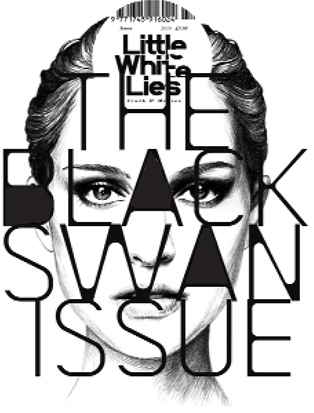
This is David Carson's February 2011 cover for Little White Lies Magazine.
- SO, this semester I will be following this rad blog called YouTheDesigner.com. It has everything. Awesome graphic design, tips and techniques AND job postings (which I'm not mad about). But this week, they featured an article on 50+ Cool Snowboard Designs. And they weren't lying. The feature definitely makes me think that design is everywhere. A snowboard definitely would not be the first place I would look for design, but this changed my mind.

For the sake of everyone's attention span...
that's all I got.
I love the way you designed you blog Allie! I think your first design was great. It's very clean and appealing. I agree that the typography and photo on your cover worked well together.
ReplyDeleteI completely agree with you that organizing a ton of information in enjoyable. I just hope mine turns out to be as organized as I am envisioning!
I haven't seen much of David Carson's work until your blog. His stuff is amazing. It's incredible how creative and original people can be. I hope I can start to think more outside the box and come up with designs someday that awe people.
I love the blog you're following and follow it myself quite a bit. I look forward to reading your blog this semester!
The illustration of the crown you did on the opening spread is great. I also really liked the "you can't miss" that you posted this week. It's really good inspiration. I really like "The Black Swan Issue" cover design.It's so different, yet it works.
ReplyDeleteDavid Carson has really interesting work and is continually pushing the envelope in his designs. His work proves the importance of editors/clients taking risks with their products to get a visually dynamic design rather than something expected. Cool find!
ReplyDeleteI like your headline treatment for your pageant spread. The illustration works really well. I also wanted to incorporate a tiara into my design, but I just couldn't illustrate one well enough. You did a great job, though, and I like how it becomes sort of an icon for the story.
ReplyDeleteGreat post on David Carson, and equally fierce decision to post that cover. I don't really keep up with what work he's doing, so I was really happy to see this.
ReplyDeleteThat Black Swan cover was awesome! I still haven't seen the movie, yet, but I really want to. That cover, though, seems to portray the darkness in the movie -- especially that unique typography!
ReplyDeleteI like that you used a cut out photo for your cover. I don't feel like it is something that we see a lot on the Vox stands. I chose to use a cut out as well, but you definitely pushed your idea a lot further than mine. I think it is good to mix things up a bit, and it definitely makes the photo really grab your attention.
ReplyDeleteSomething I wish I had done was carry that cut-out element onto the feature spread. However, I think the boxes and lines that you used to organize your text really helped set a tone for the spread, and a cut-out may not have worked as well with the layout.